Kaizen
Kaizen is a dynamic import-export firm driven by the philosophy of continuous improvement. We optimize global trade operations, streamline supply chains, and enhance efficiency while promoting economic development, cultural exchange, and international collaboration. Our goal is to lead the industry, fostering growth, sustainability, and a more interconnected world through constant improvement.
Logo Design
The logo artfully merges the initial letters “K” and “Z” from the company name, symbolizing “Kei” and “Zen.” This clever fusion not only represents continuous improvement but also evokes the concepts of import and export. The intersection of these letters creates subtle arrows, subtly portraying the seamless flow and movement of products within the global trade network. This harmonious design embodies Kaizen’s dedication to enhancing trade operations and embracing innovation in import and export endeavors.
-
![]()
Logo Mark
-
![]()
Main Logo
-
![]()
Mockup


Logo Inspo & Process
A visual representation of the design process that went into creating this logo, consisting of color palettes and elements of design, can be seen below.
-
![]()
I. Mood-board & Research
We consulted with the client, used mood boards for their vision, aligning aesthetics and colors to shape a brand tone in line with their desired atmosphere. Our visuals showcased similar industry examples, giving insight into our creative direction.
-
![]()
II. Color Palette
Blending cool greens and dark grey’s, our palette signifies trust in import-export. Greens convey growth and prosperity, while dark grey’s symbolize professionalism and stability, reflecting the industry's serious nature and the client's commitment to quality.
-
![]()
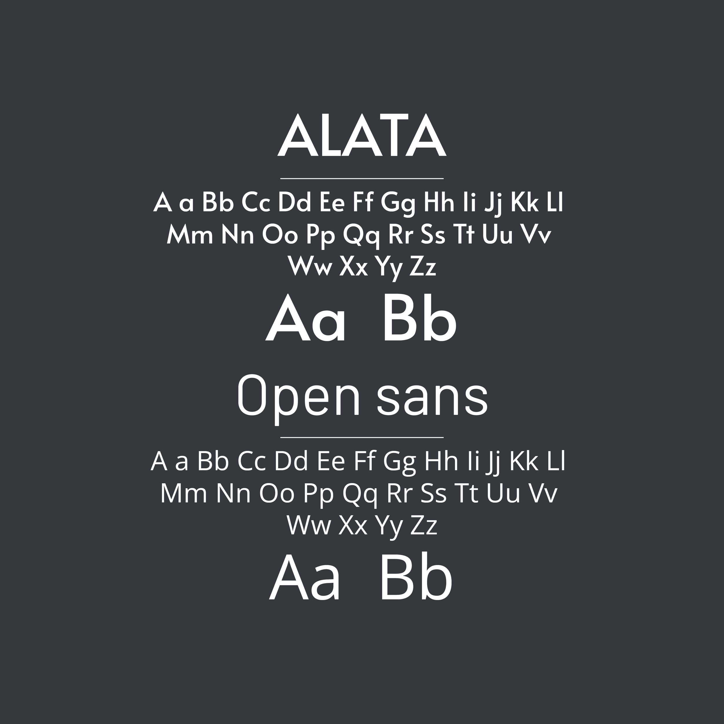
III. Font Selection
Alata's sharp design seamlessly merged with the logo's icon, embodying the brand and highlighting typography's importance. Open Sans in the body copy ensured consistency, resulting in a visually appealing and unified brand identity.
-
![]()
IV. Logo Elements
The logo creatively combines "K" and "Z" to represent "Kei" and "Zen," symbolizing improvement and global trade. Arrows within the letters depict seamless product movement, reflecting Kaizen's commitment to innovative import-export practices.
-
![]()
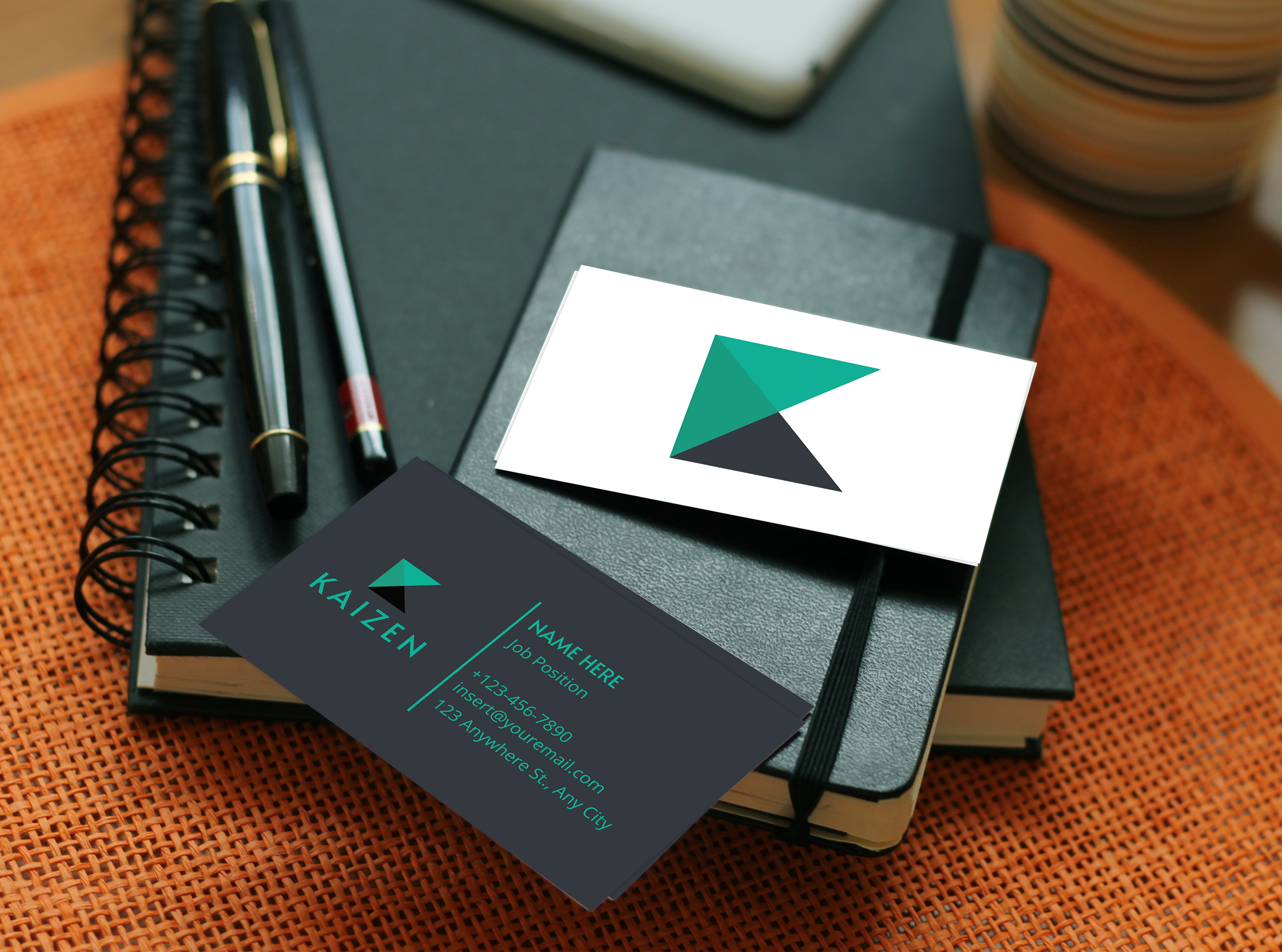
V. Approved Secondary Logo
We prioritize client empowerment, offering a flexible color variation scheme for logos. This equips clients to maintain consistency and impact across different backgrounds, streamlining design choices and enhancing their brand's adaptability.
-
![]()
VI. Mockup
Visual representation is pivotal for a brand's success, bridging concepts to reality, engaging clients, ensuring coherence, and aiding assessment. Mockups further enhance this by offering clients a realistic preview of their brand's application.


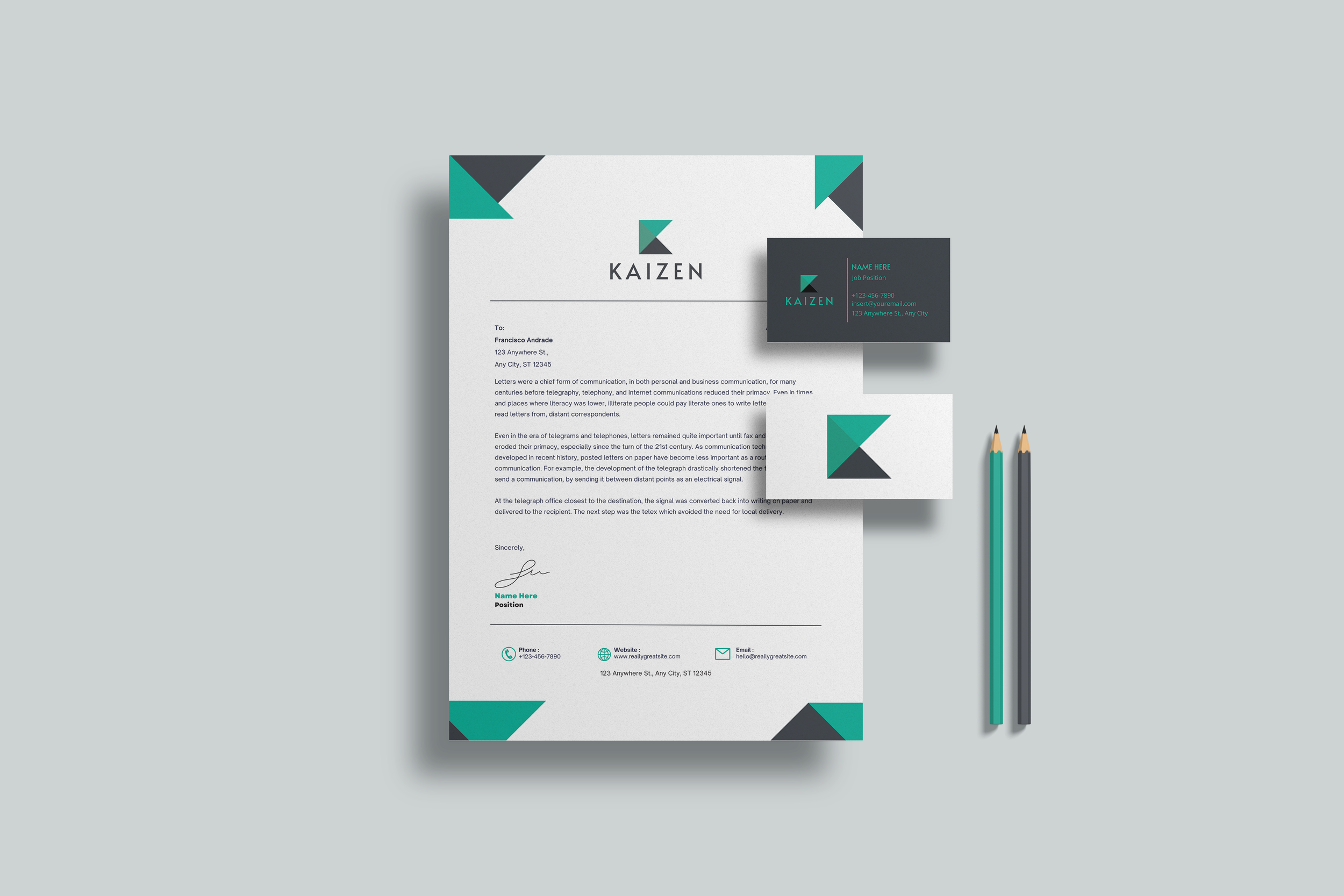
Graphic Design Services
(Letter Head Design)
The letterhead design prioritizes simplicity and user-friendliness, incorporating key brand elements and colors. While maintaining a professional look, the design subtly reflects the brand's identity, aiming to establish trust and professionalism in the eyes of clients, customers, and partners.