The Return Home
The Return Home is a therapy practice centered on reconnection, healing, and guiding individuals back to themselves. The identity reflects this journey through a soft, symbolic mark inspired by growth, presence, and inner alignment.
Designed with simplicity and intention, it creates a calm and approachable feel, allowing the brand to communicate trust, clarity, and emotional connection.
Logo Design
Our ultimate goal was to craft a calm and symbolic identity that reflects the essence of The Return Home. The design draws on themes of growth, grounding, and inner connection, expressed through soft lines and a balanced, organic form. By creating a mark that feels gentle yet meaningful, we ensured a sense of openness and trust while maintaining a refined and timeless presence. Paired with a muted, natural color palette, the identity carries a quiet strength, making the brand feel personal, intentional, and recognizable across every touchpoint.
-
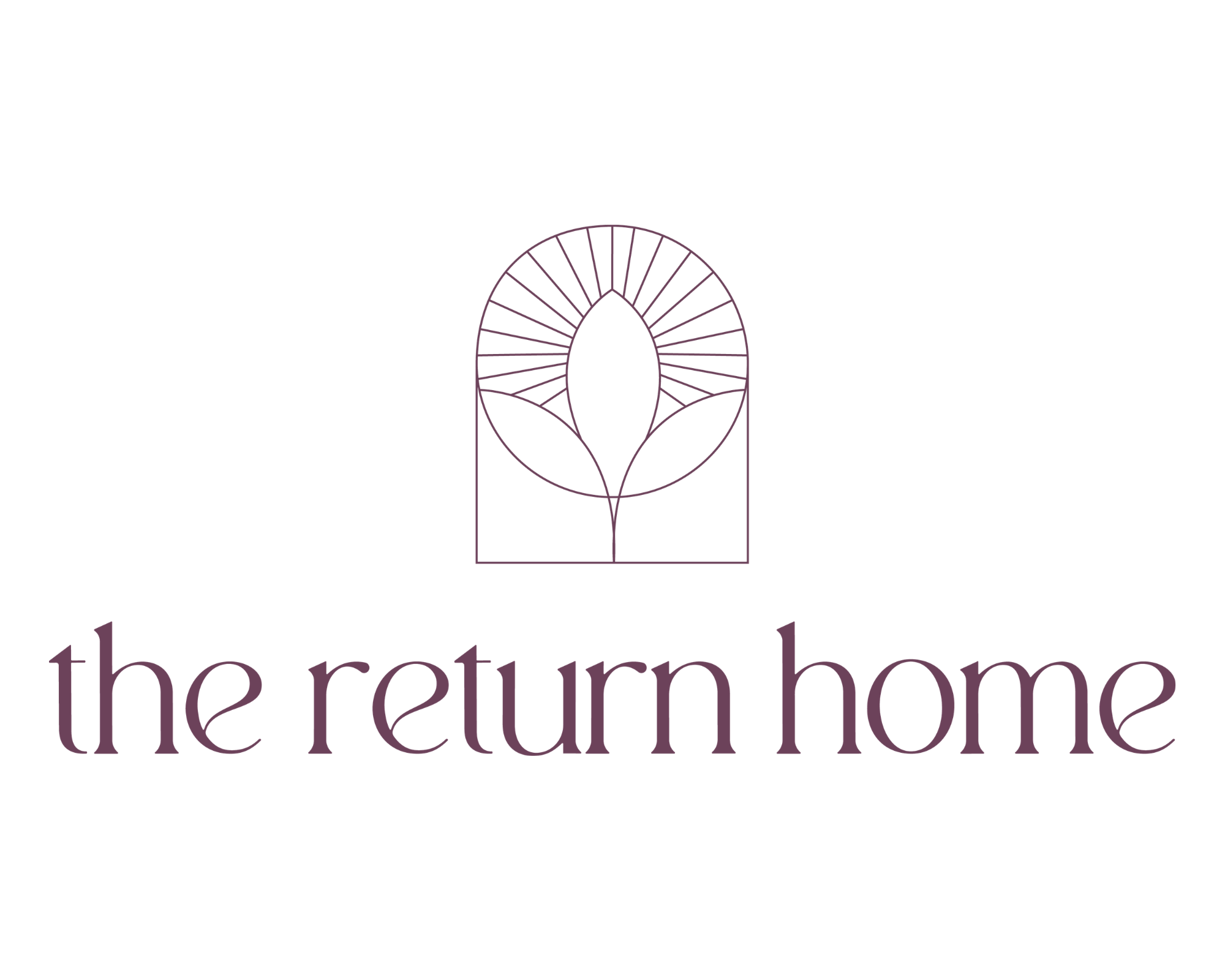
![]()
Main Logo
-
![]()
Logo Mark
-
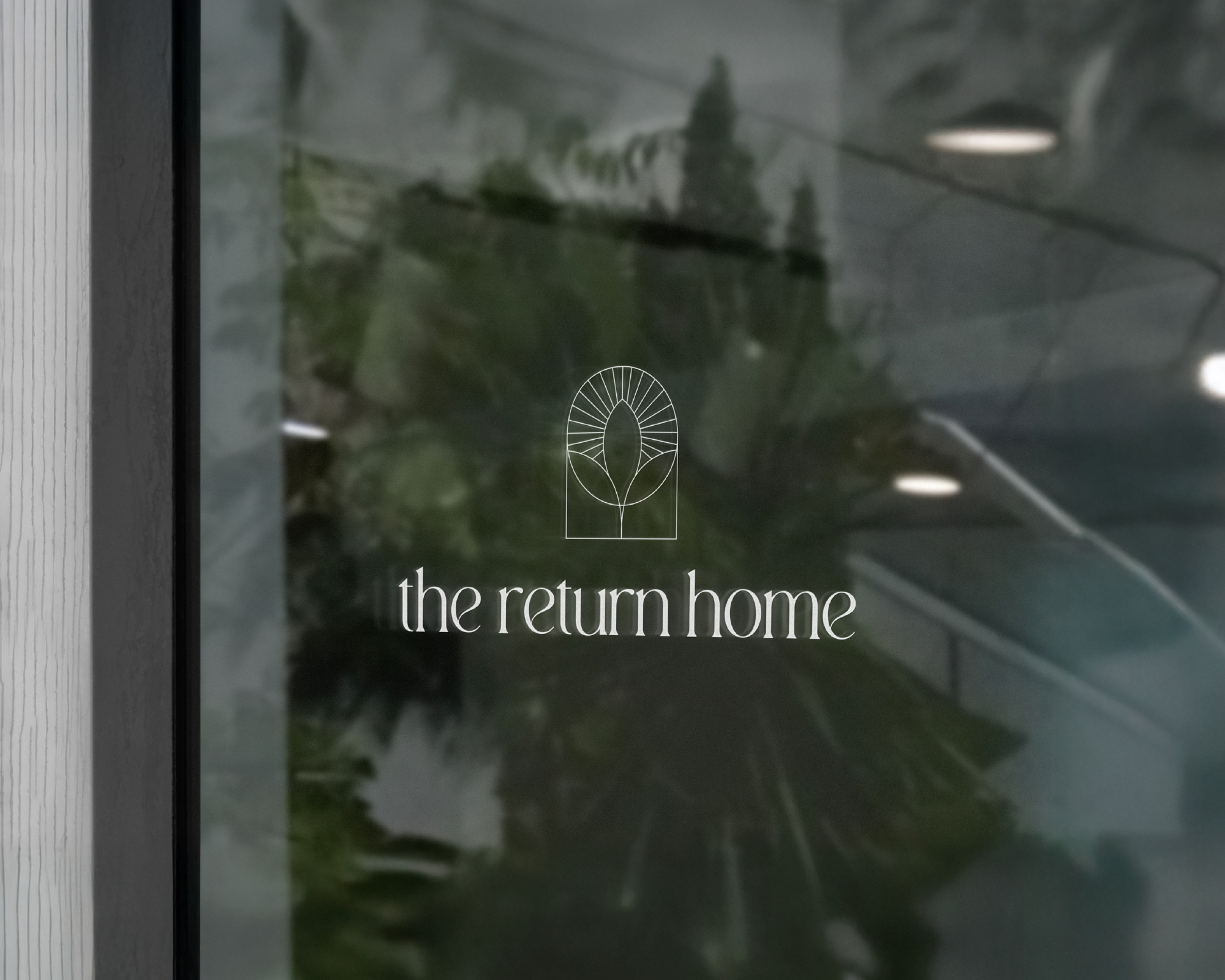
![]()
Mockup
Logo Inspo & Process
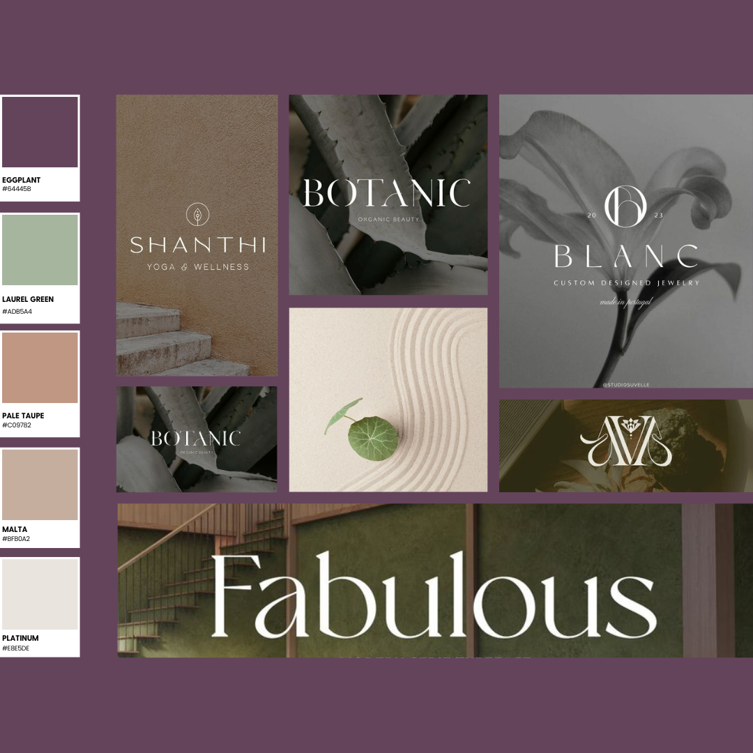
A visual representation of the design process that went into creating this logo, consisting of color palettes and elements of design, can be seen below.
-
![]()
I. Mood-board & Research
We consulted with the client, used mood boards for their vision, aligning aesthetics and colors to shape a brand tone in line with their desired atmosphere. Our visuals showcased similar industry examples, giving insight into our creative direction.
-
![]()
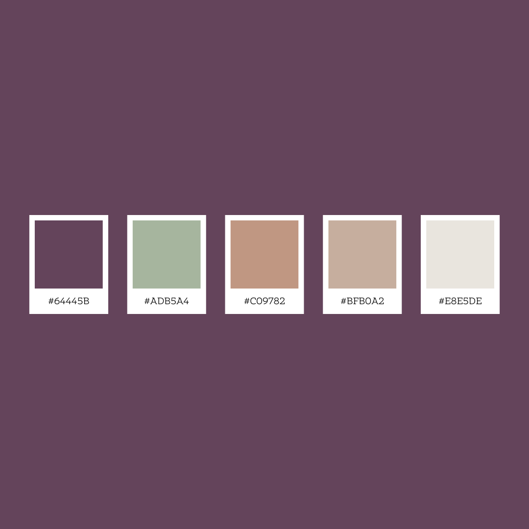
II. Color Palette
We have carefully selected a monochromatic color palette that blends deep and muted blues with subtle greys and black, creating a professional and trustworthy look. These colors are ideal for the financial advisory sector, reflecting the client's brand vision.
-
![]()
IV. Logo Elements
The logo uses capitalized initials and a small ampersand for clarity and symbolism, blending modern and classical styles. This design ensures a strong, coherent brand identity for recognition in financial services, suitable for favicons, social media, and branding.
-
![]()
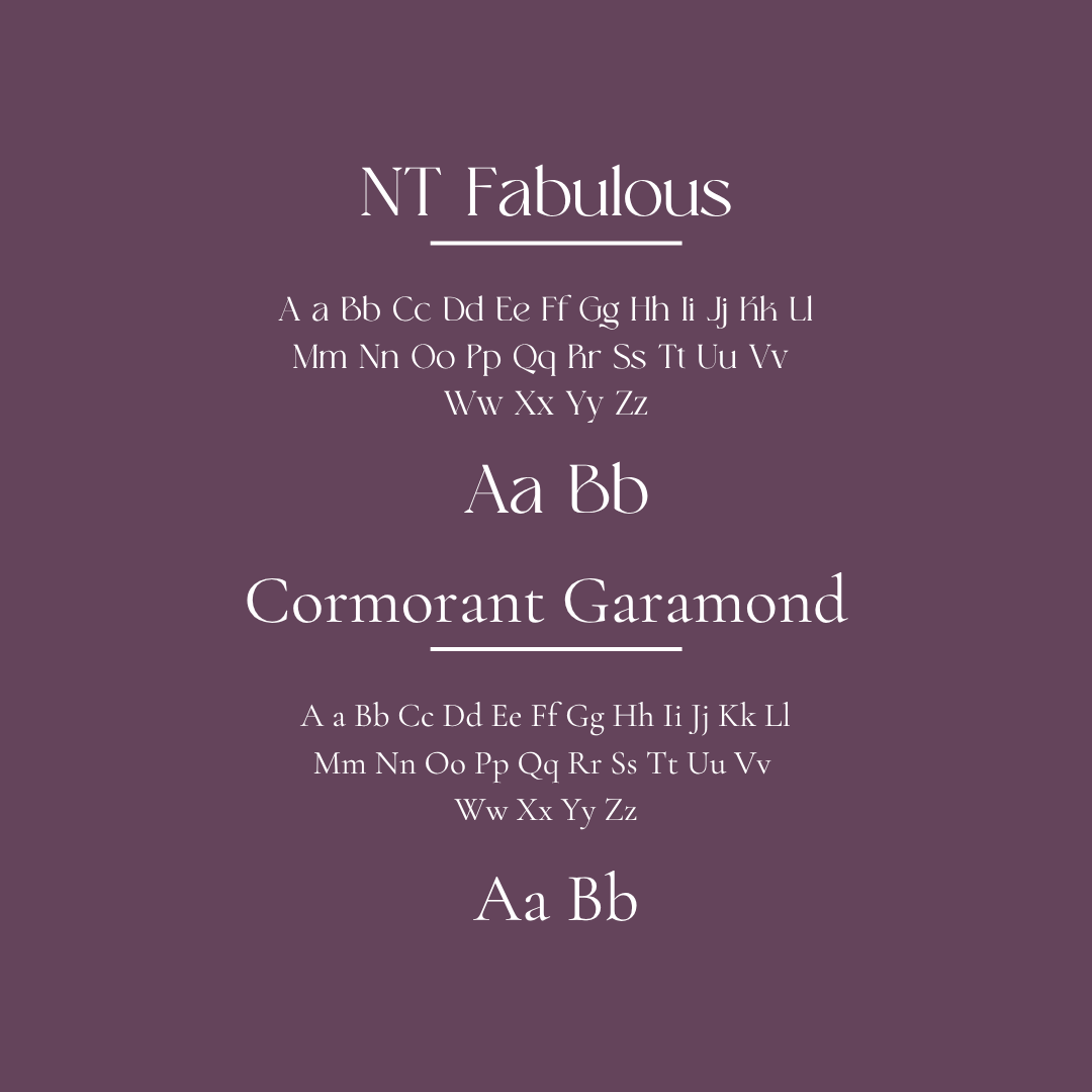
III. Font Selection
Combining Bodoni and Roboto achieves a balance of classic elegance and modern clarity. Bodoni adds sophistication and authority, while Roboto ensures readability and approachability. This blend reinforces our professionalism and clear communication.
-
![]()
V. Approved Primary Logo
We prioritize client empowerment, offering a flexible color variation scheme for logos. This equips clients to maintain consistency and impact across different backgrounds, streamlining design choices and enhancing their brand's adaptability.
-
![]()
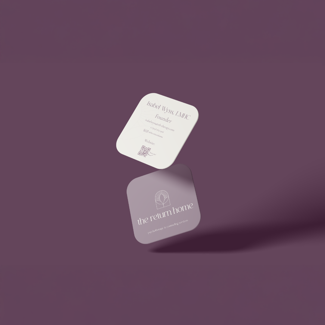
VI. Mockup 1
Visual representation is pivotal for a brand's success, bridging concepts to reality, engaging clients, ensuring coherence, and aiding assessment. Mockups further enhance this by offering clients a realistic preview of their brand's application.
-
![]()
VI. Mockup 2
Visual representations of a stationary kit encompass a comprehensive range of design elements, showcasing the brand's versatility. This allows the client to envision how the design can be seamlessly integrated across various applications, offering insights into potential future uses.

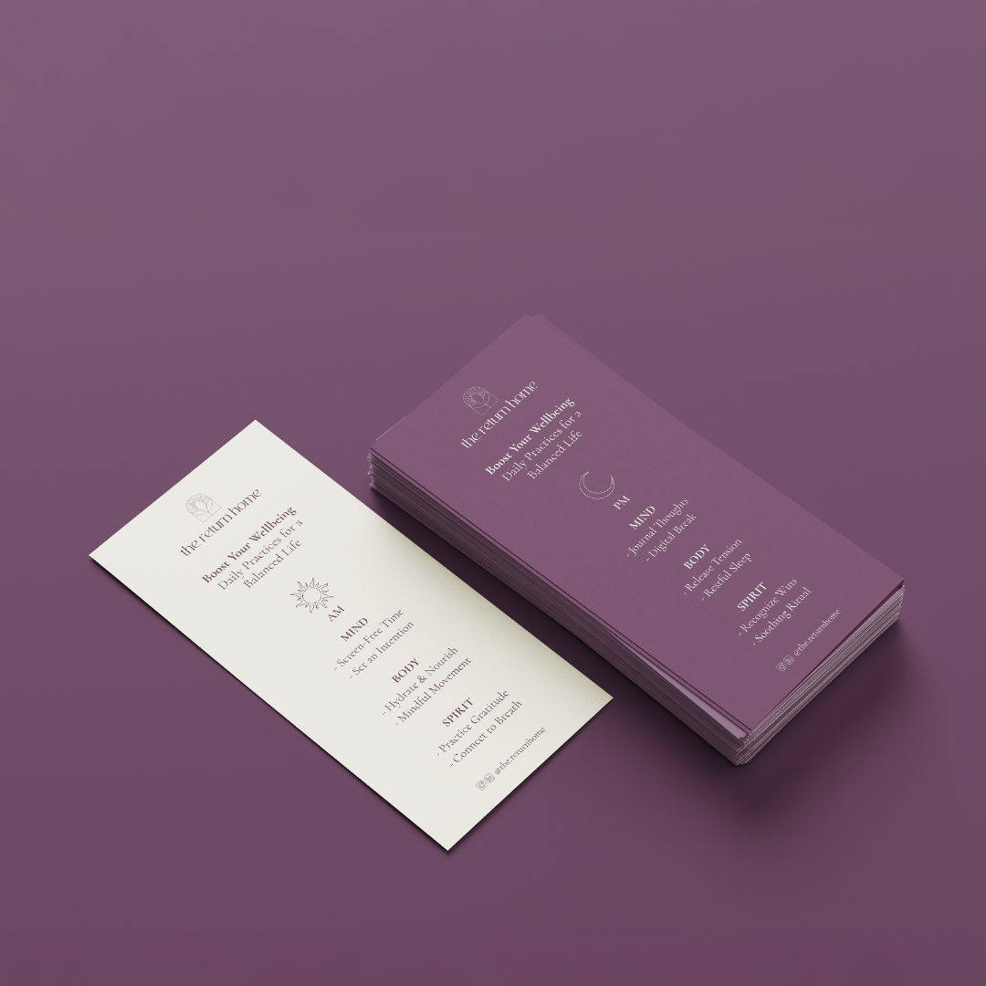
Stationary
The stationery design includes business cards and a flyer that reflect a calm and refined brand presence. The soft, muted color palette creates a balanced and cohesive look, with the business cards featuring a minimal layout and subtle detailing for clarity and elegance. The flyer maintains this consistency through structured content and thoughtful spacing, ensuring the information is both approachable and easy to read. This cohesive stationery system reinforces the brand identity, enhancing recognition and ensuring all communications reflect a sense of trust, intention, and quality.
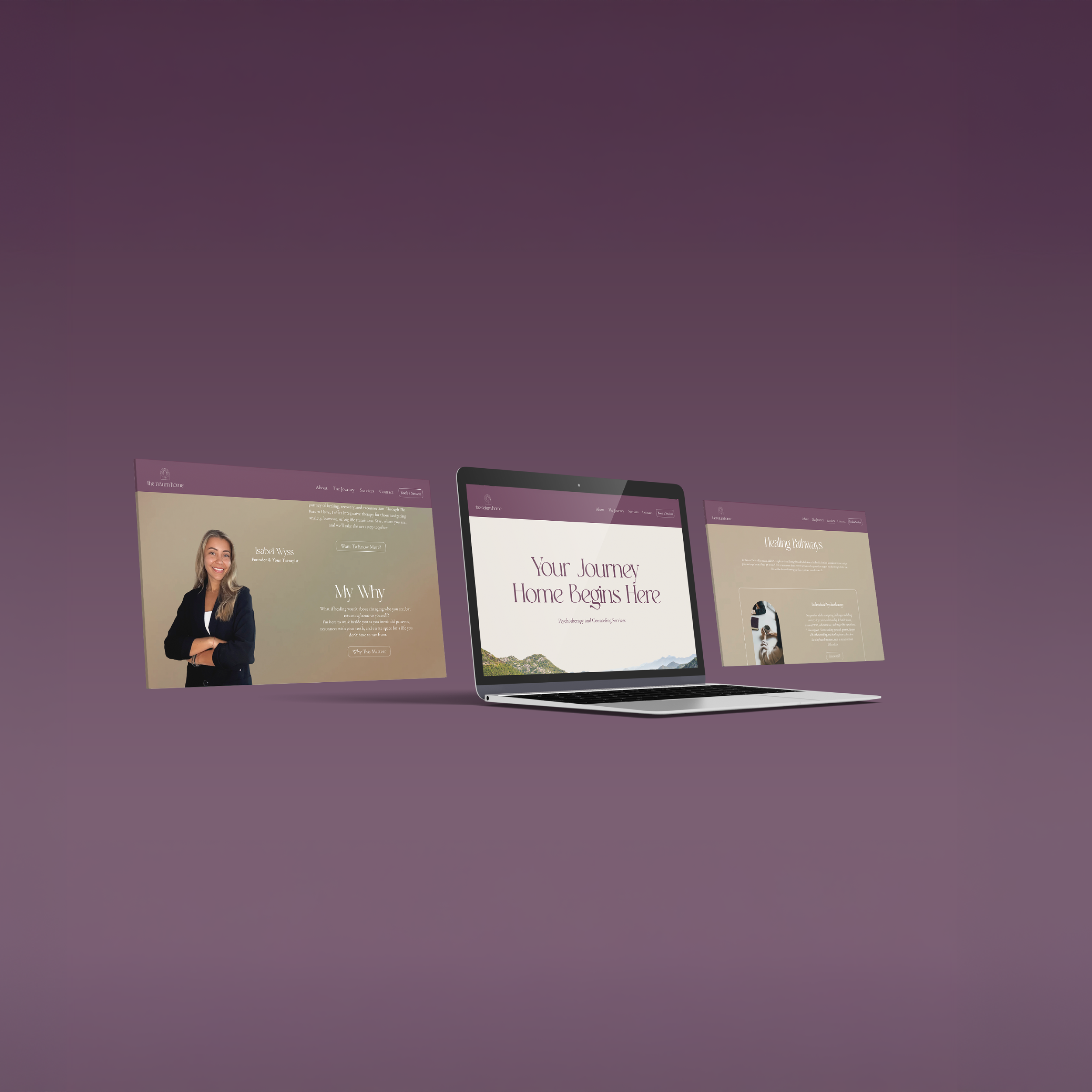
Web Design
A calm and intentional digital experience, aligned with the brand’s focus on clarity and connection. The soft, muted palette carries through the interface, creating a cohesive and welcoming feel.
The layout is clean and structured, with clear typography and intuitive navigation that guides users seamlessly. This cohesive approach reinforces the brand identity, ensuring every interaction feels consistent, approachable, and aligned with its values.