

YoSoy Centro Americano
YoSoy is a Central American restaurant that serves classic home style dishes. For this project, we created a brand identity for YoSoy. We focused on the banana tree as a key design element for its role in Central American culture. We then isolated specific colors that represent that concept to create a cohesive color palette. Demonstrated below is their primary and secondary logo design.
Logo Design
It all begins with an idea. Maybe you want to launch a business. Maybe you want to turn a hobby into something more. Or maybe you have a creative project to share with the world. Whatever it is, the way you tell your story online can make all the difference.
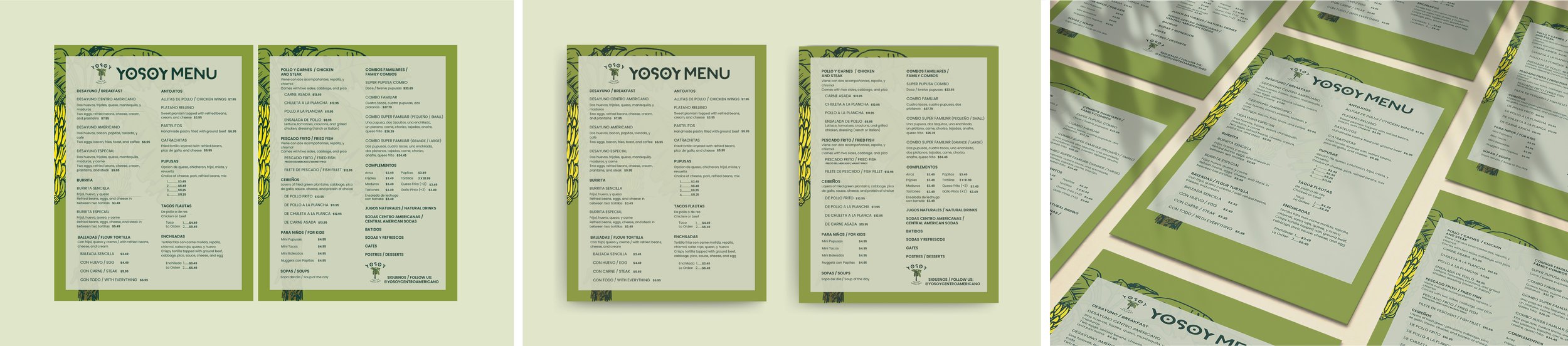
Menu
After creating the brand identity, we were asked to create business cards, a double sided menu and flyer for the restaurant. Our goal was to keep the menu and flyer design simple, yet consistent with YoSoy's theme. Keeping the menu design simple enabled us to incorporate the design element without making the layout to crowded and overly concentrated.
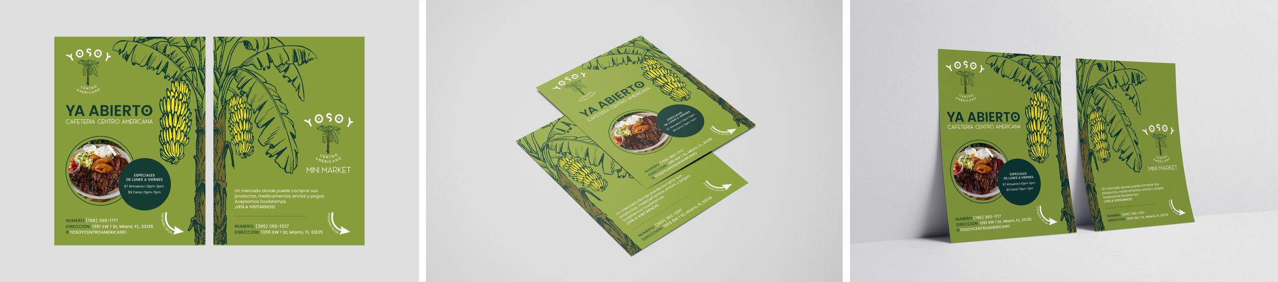
Flyer
The flyer was meant to encapsulate the same feeling and emotion expressed in the menu. As you can see in the Flyer, the banana tree has a more prominent presence, which was meant to give off a tropical vibe when people see it. In addition to being more balanced and aesthetically pleasing, the green was mildly vibrant without being too bright.
Business Cards
Also, the business cards were an excellent way to represent the banana tree used in the flyer, logo & menu. The design was kept simple to avoid crowding the eye. With the calm layout of the back showing the tree alongside the text, it draws the viewer's attention to the information.
